How to Use Date vs Date Hierarchy in Power BI: A Comprehensive Guide (2024)
Power BI is a flexible data visualization tool that helps organizations make data-driven decisions. Most Power BI date visualization problems people hit come down to how the tool handles dates. In this blog post, we will explore two crucial aspects of hierarchies in Power BI: Date and Date Hierarchy.
The feature that causes the most confusion is that Power BI has built-in functionality that will display a drillable hierarchy of year, quarter, month, and days when a column, formatted as a date, is dropped onto a visualization. This article and example will help explain.
In This Article:
What are Data Hierarchies in Power BI
Before we explore the best practices for using Date and Date Hierarchy, let’s define these terms and understand Data Hierarchies.
Before we explore the best practices for using Date and Date Hierarchy, let’s define these terms and understand Data Hierarchies.
Hierarchies in Power BI help to organize data into multiple levels, which enables users to explore data at different granularities by drilling down or up through these levels. A hierarchical structure makes it easier for users to navigate and analyze data logically and intuitively. The example below illustrates how various values can be grouped together in a hierarchy.
Hierarchies help organize data with a natural multilevel structure, such as time series, geographic regions, or organizational structures. As a result, they simplify complex data and provide a comprehensive view, enabling users to make informed decisions based on trends and patterns across different levels of detail.
The sales dataset includes transaction information for various cities and regions. The dataset is organized into a two-level hierarchy based on the Region and Facility columns in the facility table. This hierarchical structure allows users to analyze regional and facility-level sales data, providing a more granulated view of regional trends.
Power BI Hierarchy example. The portion is blurred for clarity.
The key benefit of utilizing hierarchies in Power BI is that end-users can easily spot patterns, identify outliers, and gain valuable insights across multiple data dimensions.
Dates are handled a little differently; let’s examine this.
What is a Date in Power BI?
A Date is a data type in Power BI that represents a specific day, month, and year. It is commonly used to track time-based events, such as sales transactions or project milestones.
Examples:
2023-04-15
2023-01-01
What is a Date Hierarchy in Power BI?
A Date Hierarchy is a structured way of organizing dates in Power BI, allowing you to drill down from a high-level time period (such as a year) to more granular levels (such as quarters, months, or days). This provides a more in-depth view of your data and allows for more advanced analyses.
A Date Hierarchy is a powerful tool in Power BI that allows users to analyze data across different levels of granularity, such as a year to more granular levels, such as quarters, months, or days. For example, you can analyze data at the day, month, quarter, and year levels. This flexibility enables more insights into trends in your data over time.
Example:
Year: 2023
Quarter: Q1
Month: January
Day: 2023-01-01
Critical Differences Between Date and Date Hierarchy
Even though both are the same original data, having a hierarchy provides several useful features for your analytics, such as;
Data structure: Date is a flat data type, while Date Hierarchy is hierarchical. Creating the structure is an easy task in Power BI.
Flexibility: Date provides more flexibility in formatting and displaying data, while Date Hierarchy has predefined levels with which the user is already familiar.
Granularity: Date Hierarchy allows you to drill down and up through different levels of time periods while Date is limited to a single day.
How to Use Date in Power BI
Now that we understand the difference between Date and Date Hierarchy let’s learn how to use Date in Power BI.
Adding a Date Field to a Power BI Report
Importing data with Date columns: Ensure your data source contains columns formatted as a Date data type. Power BI will automatically recognize these columns and treat them as Date fields.
Adding a Date slicer or filter: You can add a slicer or filter to your report to allow users to filter the data based on a specific date or range of dates.
Customizing Date Visuals in Power BI
Choosing the appropriate visual type: Date fields can be used in various visuals, such as line charts, bar charts, or tables. Choose the visual type that best represents your data and the insights you want to highlight.
Formatting Date display options: You can customize how the Date is displayed in your visuals by changing the format, such as using “MMM YYYY” to display “Apr 2023.”
Applying conditional formatting to highlight insights: Use conditional formatting to highlight specific dates or ranges based on rules, such as showing dates with higher sales in a different color.
How to Use Date Hierarchy in Power BI
Let’s now explore how to use Date Hierarchy in Power BI.
Creating a Date Hierarchy in Power BI
There are two ways to accomplish this.
Create a Date Hierarchy using a Date table: You can create a custom Date Hierarchy by adding calculated columns for different time periods (e.g., Year, Quarter, Month) to your Date table and then using the “New Hierarchy” feature in Power BI.
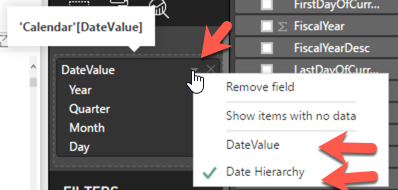
Automatically generated Power BI Date Hierarchies for imported data: Power BI will automatically generate a Date Hierarchy for imported data containing date columns. You can access this hierarchy by expanding the date column in the Fields pane. As shown on the left below, you drag the Date Value column over to the table; you see the Column and Power BI’s generated Hierarchy date.
Drag the Table Column Value over to the Grid.
The complete Hierarchy is displayed.
You can select what you want to see in the visual using the icon.
Select the Value or the Hierarchy.
This works on many compatible visuals, such as
bar charts, column charts, or treemaps.
Using Date Hierarchy in Power BI Visuals
You do not see this in all visuals. You can access a data hierarchy in 3 ways.
Date Hierarchies work well with visuals that support hierarchical data, such as bar charts, column charts, or treemaps.
You can expand or collapse different levels of the Date Hierarchy in your visual to show more or less detail.
Use the drill-down and up functionality to navigate through different levels of the hierarchy, allowing for in-depth data exploration.
Customizing Date Hierarchy Visuals in Power BI
Navigating the hierarchies can be difficult.
Formatting display options for different hierarchy levels: Customize the display format for each level of the Date Hierarchy to ensure consistency and clarity.
Sorting and filtering data within a Date Hierarchy: You can sort and filter data within the hierarchy to focus on specific time periods or trends.
Sometimes More Than One Way
As with most data analysis tasks, working with time can be the most challenging detail to get correct. Power BI has built-in functionality that will display a drillable hierarchy of year, quarter, month, and days when a column, formatted as a date, is dropped onto a visualization. This feature can be handy in the proper visualization, as illustrated in the example below.
Drag & Drop A Data Value – A Date Hierarchy Shows Up
If you create a table and drag a field formatted as a date, you do not get a single date but the hierarchy pictured below. This creates a built-in way to drill down through the year on various graphs and tables.
A date visualization allows you to provide different views of your data over time. Depending on your needs, you can remove a level from the list by selecting the ‘X’ next to the level.
However, this behavior is the default. If you want to show the actual date field, you must click on the down arrow next to the date field, as shown below. This allows changing the selection from the Date Hierarchy to the field that contains your Date Values.
How To Removing Unwanted Levels in the Hierarchy
Note: You can also remove levels of the hierarchy you do not wish to show. Let us say you do not want the Day level. You can click the “X” to remove that level. If you want to show the Year-Month-Day, you can click the “X” on the Quarter level.
You can click the “X” to remove that level. If you want to show the Year-Month-Day, you can click the “X” on the Quarter level.
The main caveat here is that your labels need to make sense, and your sort order needs to match what you want to show. For example, if you get rid of the month level, your day needs to have the month in the label to make sense. May 2, for example.
Example, How to Drill Down Dates in Charts
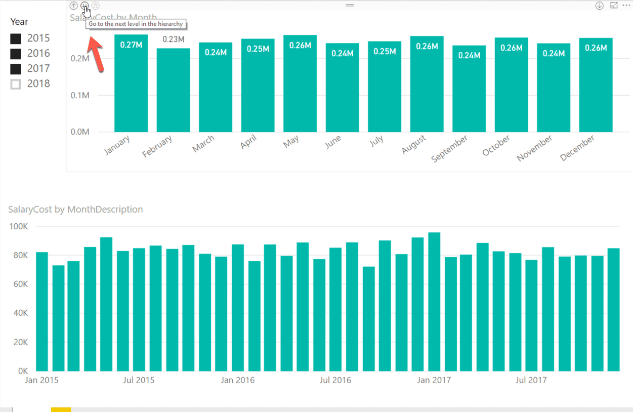
The two charts below illustrate the two different options. The top chart, using Date Hierarchy, allows you to use the visualization’s drill-down functionality, and the bottom graph, showing Date Value, shows the values as they appear in the data table. With three years selected, the bottom graph shows all the months over those years, whereas the top graph, using the hierarchy, totals all the years into each month.
You need to add a filter or slicer to ensure you look at the data for only one year and design your visualization to ensure your end-user follows your data storytelling and does not make a mistake or get lost.
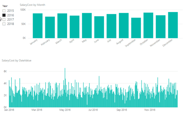
The built-in date hierarchy feature allows the adding time drill functionality; you must be careful when showing and selecting the correct values in your visuals. The final version is shown below, with the months showing only the totals for the selected year. The slicer is set so only one value at a time can be selected.
Final Version with Month Hierarchy.
Conclusion
In this blog post, we explored the differences between Date and Date Hierarchy in Power BI and how to use them in your reports effectively. This feature allows you to create powerful and insightful visuals that help drive data-driven decision-making.
FAQ
Q. What is Date Hierarchy in Power BI?
A. Date Hierarchy in Power BI is a feature that allows users to group dates by different levels, such as year, quarter, month, day, and even hours. This feature makes it easy to perform time-based analysis and visualization in Power BI reports.
Q. How can I access the Date Hierarchy in Power BI?
A. You can access the Date Hierarchy feature in Power BI in three ways: the Date table, the Modeling tab in the ribbon, or the data field properties of the visual.
Q. Which visuals work best with Date Hierarchy in Power BI?
Date Hierarchy works well with visuals that support hierarchical data, such as bar charts, column charts, or treemaps.
Q. How can I customize Date Hierarchy visuals in Power BI?
You can customize Date Hierarchy visuals in Power BI by formatting display options for different hierarchy levels and sorting and filtering data within the hierarchy to focus on specific time periods or trends.
Q. Is it possible to drill down and up in Date Hierarchy visuals?
Yes, you can use the drill-down and up functionality to navigate through different levels of the hierarchy, allowing for in-depth data exploration.


