Data Visualization Case Study: Pie Charts are Evil?
Are pie charts evil? Given the correct situation, pie charts can be used to your advantage in telling your data story. The following case study uses Power BI samples to review examples and provide recommendations to get the most out of an often misused visualization in Excel or Power BI.
I have seen many examples of poorly used pie charts and shiver each time I come across one in a report. The goal of a pie chart is to show how each segment relates to the entire data set.
Note: Article Updated Sept 2024
Issues with Pie Charts
The following example, published by Statistics Canada, illustrates most of the problems you encounter. It shows the distribution of the Aboriginal population by province over two surveys. You would want to compare the distribution between provinces and compare that to the values 16 years later.
Statistics Canada Pie Chart for Aboriginal Population by Province
Too Much Data Makes for too Much Noise
The more data you have on any chart, the more difficult it is to see differences between the various data points. As illustrated in the above example, the meaning behind the data can get lost because of the amount of data on the graphic. Pie Charts make this more difficult because each segment gets divided up between the 360-degree nature of the visualization. Significant differences are easier to see, but differences are hard to make out if groupings of like values exist.
Cannot Determine the Difference in the Data
When you look at the different segments, it is tough to see the differences between each element, as they are all in a circle, and the eye finds it difficult to relate each segment to the other. When comparing the differences between the years, we are faced with two separate charts, making it difficult for the eye to compare the results.
The Story You Are Trying to Convey
Given the two issues above, pie charts can cause the story you are trying to tell to get lost in the data. This can lead to misinterpretation and a loss of confidence in your argument. The charts below show the same information using PowerBI or Excel; however, they demonstrate a horizontal bar chart that displays the data and trends more effectively than the original.
Original charts converted to Power BI with the below image that conveys the information in bar chart form.
Using Pie Charts vs Horizontal Bar Charts. Which do you prefer?
Make Pie Charts Work: A Case Study
A group had a survey that asked their organization which month they would like a corporate event. The survey’s author and management thought September would be the preferred month for the event.
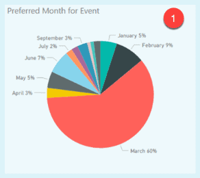
The survey results are pictured below with the original chart (1), with the vast majority selecting March. This created a problem for the committee, as they now needed to convince management that March was the preferred month and needed a strong visualization they could include in their report.
Shows various versions of the survey information summary detailed below.
Example 1 – Original Pie Chart
Example 1 – Original Pie Chart
The main story for the report was the overwhelming choice of March for the event. There is an abundance of information that is not required for the view. If the month and percentage are supplied, the eye is drawn to clumping information at the top of the chart. This removes the message, as the grouping takes the eye’s focus away from the result. The eye is drawn to more detail at the top of the chart first.
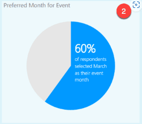
Example 2 – Final Pie Chart
Example 2 – Final Pie Chart
The chart clearly conveys the survey result that March was the preferred month. With a value much higher than the others, it denotes that only the main response fits this situation. The point of the topic is displayed without letting the reader get lost in all the other information.
Additionally, the value for March is more than half, which shows the reader that no matter how many responses are provided, this one is the majority. This makes it safer to group all the other responses to Other.
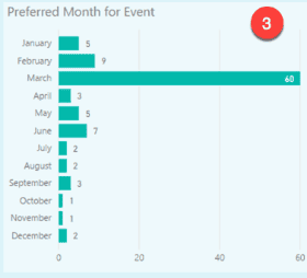
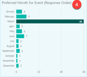
Examples 3 & 4 – View with all values
Example 3 with Data
You may still want to provide a summary of all responses. I prefer a horizontal bar chart. Example 4 would be my final version if all the data were required. This has the data bar you want to draw attention to darker than the others. All the information is displayed, yet your eye is brought to the point you want to illustrate.
Example 4 with Data
A pie chart shows the relationship between the parts of a whole. When data points are easily discernible, differences in those relationships can be demonstrated using pie charts to your advantage. Every chart has a purpose. You can make pie charts work for your data visualization project with the correct questions and the proper data.
Conclusion
This blog post shows how pie charts can be misleading, confusing, or inaccurate when used improperly. Pie charts are designed to show the relative proportions of different categories as a whole, but they can fail to convey the data's true magnitude, distribution, or relationship. Some common pitfalls of pie charts are using too many slices, 3D effects, unequal angles or areas, comparing multiple pie charts, and omitting labels or legends.
To avoid these problems, we should always consider the purpose and audience of our data visualization and choose the most appropriate chart type for our data. Pie charts can be helpful in some situations, but they are not always the best choice. We should always be careful and critical when creating or interpreting pie charts.


