Why use Visualizations and Infographics With Data Storytelling
They say a picture is worth a thousand words, but you can use a well-designed graphic to help the reader understand your point of view by telling a story. Using Visualizations and Infographics with Data Storytelling can become the vehicle that leads a reader through your Power BI narrative. Having an infographic or series of visuals allows one to tell a story and provides greater understanding than simply having text alone.
I read a fantastic article, published in April 2015, by Allison Stadd entitled, 15 Data Visualizations That Will Blow Your Mind, which shows examples of using visuals to tell a story. A quote from the article resonated with me;
“The best data visualizations are storytelling tools that spark discussion and elicit calls to action.”
Infographic Lesson Plans
Numerical data is not the only information that benefits from visualization. The following infographic was for a full-day training session that covered a great deal of information. In most workshops, people will only take out and remember a few important points. Providing a structure that leverages how adults learn is essential. See my article, Mastering Adult Learning in Technical Education: A Guide to Effective Instructional Design, where I review this topic in more detail.
Training Workshop handout outline. The key was separating the full-day session into a nice takeaway that would provide an easy-to-see and understandable pager summary.
Interactive Infographics
Infographics are an excellent example of storytelling, and they are gaining in popularity as writers try to capture readers’ attention with complex topics. A quick search on Pinterest will provide many examples of how infographics are used to tell a story.
Tools like Microsoft’s Power BI and Salesforce’s Tableau platform allow the creation of very sophisticated data visualization solutions.
Power BI interactive report sample. The info box, for example, provides critical information. Then, interactivity, such as selecting various objects, lets the user do "Point-Of-Thought" analysis as they see a trend or anomaly that needs further investigation.
Proactive Reporting - Exception Reporting
Exception Reporting
Visualizations and infographics play a crucial role in data storytelling by making complex information more accessible and engaging for the audience. A powerful technique is using exception-based reporting to highlight values that exceed predetermined thresholds, drawing immediate attention to anomalies or outliers.
These visual cues help decision-makers quickly identify areas that require further investigation, enabling them to focus on critical issues without sifting through overwhelming data. Stakeholders can take swift, informed action by drilling into these critical KPIs, such as financial losses or performance inefficiencies. Ultimately, visualizing exceptions simplifies the analysis process and enhances the clarity and impact of your data-driven narrative.
Proactive Reporting
This brings up the related concept of proactive reporting, which involves generating reports anticipating decision-maker's needs before issues arise. For example, producing a report containing important information on potential risks, upcoming deadlines, or performance metrics trending toward critical thresholds allows teams to address challenges before they escalate. By identifying patterns early and providing actionable insights, proactive reporting empowers stakeholders to make informed decisions and take preventative action rather than simply reacting to problems after they occur.
Providing exception reporting that highlights values that exceed thresholds allows bringing forward and drilling into themes that require immediate attention. Proactive Reporting, which shows the report with the key event metric for people choosing when they would like the event.
Even though the bar is the longest in this example, having the maximum value a different color allows it to jump out of the graphic saying, "Look At ME."
Animated Graphic Reports
Taking a multi-step article and putting the information into an animated infographic makes the data easier to digest and more accessible to more people. USA Today has a section on interactive graphics that they use in various news stories, illustrating how they have utilized this trend.
This is what drew me into working with data;
To help people advance their point of view by giving them the ability to tell their story through data.
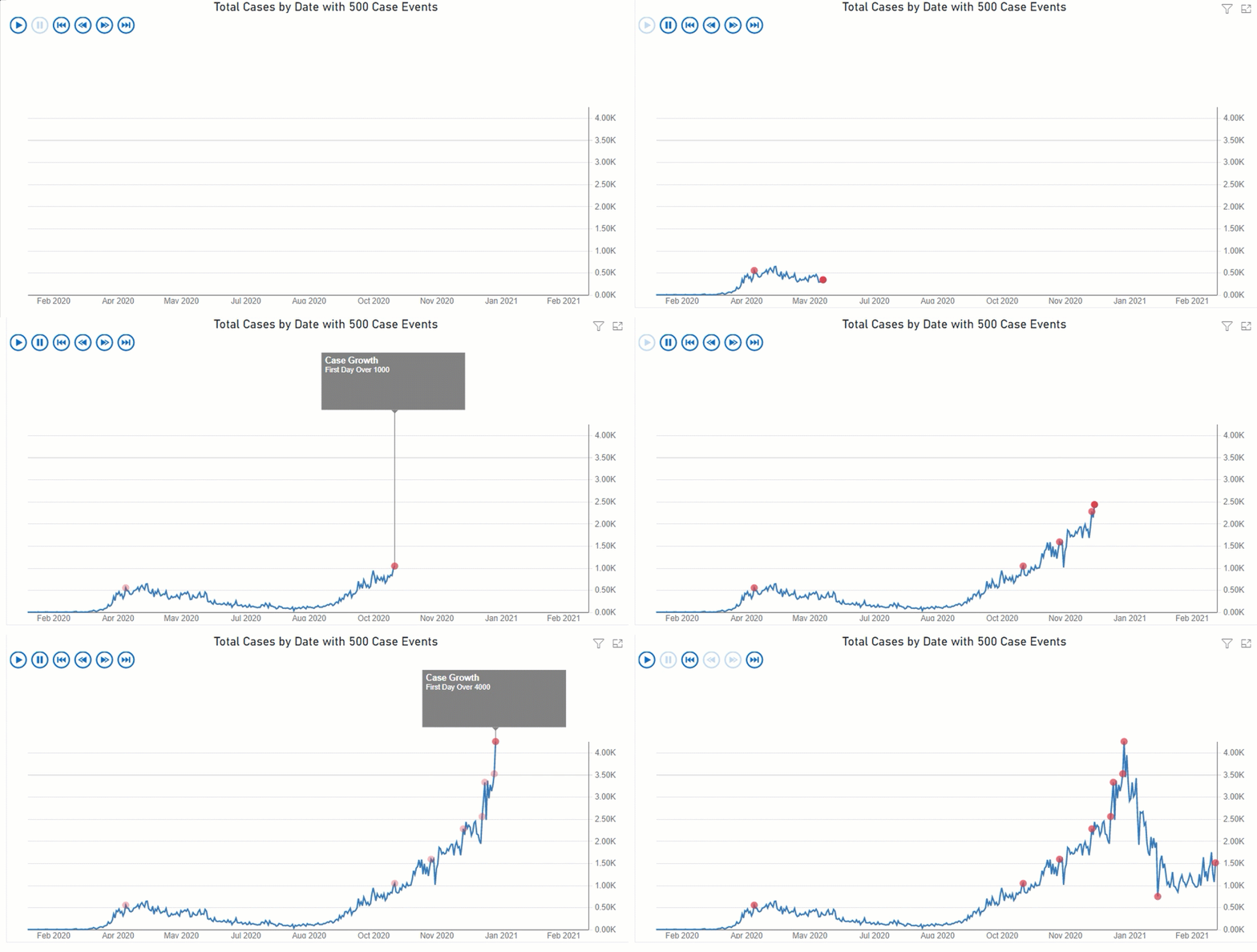
As shown below, the number of daily cases by day visually shows the event growth over time.
The Pulse chart allows you to show critical events on a timeline and then animate them with a playback of the events to reveal patterns and insights. There is no better way to learn about this chart than to see it in action, so let’s go through a quick tutorial to build the following visualization.
You can summarize a thousand lines of data in a well-designed visual that will convey your point with a more significant impact than having hundreds of words of text. In addition, adding visuals will engage your readers and help to lead them through complex topics.
Power BI has a custom visual; the Pulse Chart is a custom visual and not an out-of-the-box visualization installed into Power BI natively.
Wrapping UP
In conclusion, incorporating visualizations and infographics into data storytelling can transform how your audience engages with your information. As the saying goes, "A picture is worth a thousand words," but it's even more powerful in the context of data—it can spark discussions and drive decisions.
When used effectively in tools like Power BI, these visuals provide clarity, enhance understanding, and guide readers through the narrative you’re crafting. As Allison Stadd beautifully said, "The best data visualizations are storytelling tools that spark discussion and elicit calls to action." So, as you develop your next report or presentation, remember that a well-placed graphic or visual can be the key to turning data into a compelling and actionable story.
Further Reading
9 popular ways to perform Data Visualization in Python – Python is hot in data analytics. This article has some examples of using Python in data visualization.
I have a few articles I wrote that tell a little more about telling stories with data visualizations;


