Time Graph Tells A Story - Power BI Pulse Chart
The Power BI Pulse Chart is a visualization tool that can help you take your data storytelling to the next level. It lets you highlight critical events over time in an engaging way by animating them on a timeline. Using a time animation can uncover hidden patterns and insights that might have gone unnoticed otherwise. Using time in data storytelling story can be one of the most valuable tools in your visualization toolbox to tell your data story
Great Example of Using Time
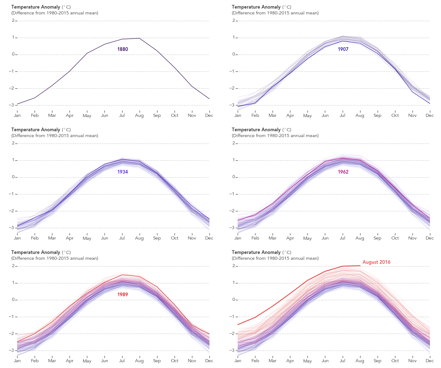
This visualization from Climate Time Machine (nasa.gov) and Earth Matters – Visualizing the Warmest August in 136 Years (nasa.gov) are great examples of using Time Animation to tell a story. Over time, the animation shows precisely what the authors intended in a straightforward and visual way. The colors are not jarring and change with the intensity of the data. The most interesting takeaway was the building year by year, showing the average increase as we get to the highest values today.
NASA Earth Observatory chart by Joshua Stevens, based on data from the NASA Goddard Institute for Space Studies.
This image is used under, https://earthobservatory.nasa.gov/image-use-policy
Source: Earth Matters – Visualizing the Warmest August in 136 Years (nasa.gov)
This example shows the power of telling a story with your data and effectively communicating that point. It was a perfect visualization example for the temperature data's trend over time. We can use the time to tell a story in Power BI with visualizations like the Pulse Chart.
What are Pulse Charts?
Power BI has a gallery of visuals in the Business Apps – Microsoft AppSource Market Place you can bring into Dashboards. However, the Pulse Chart is a custom visual and not an out-of-the-box visualization installed into Power BI natively.
The Pulse chart allows you to show critical events on a timeline and then animate them with a playback of the events to reveal patterns and insights. There is no better way to learn about this chart than to see it in action, so let’s go through a quick tutorial to build the following visualization.
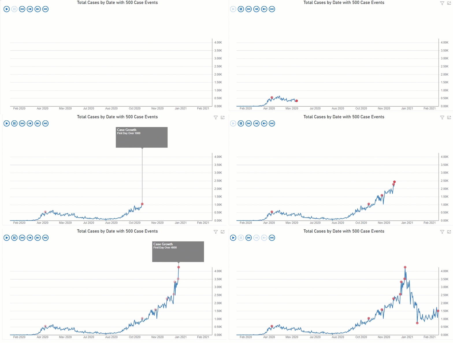
Animated Gif (90 seconds) of the Pulse Chart showing Daily Case Count.
Highlighting when the Daily Count is a multiple of 500 as a Highlighted Events
How to Tell a Story over Time
The data point was to show the increase in the rate of cases over the time of the outbreak. As you see from the above visualization, an event occurs as a multiple of 500 case thresholds is broken. As time moves on, the numbers get larger, but what can be missed is the rate of increase in the daily case count.
By having an event occur each time a barrier is broken, the points are close together as the cases arise. As time passes, the rate at which the case multiple of 500 is broken speeds up. It tells more of the story than just having the line chart.
Power BI Pulse Chart – Tutorial
Step By Step - Tutorial
Step 1 – Find the Pulse Chart and add it to Power BI
Once you have opened a new Power BI Book in Power BI Desktop, you will see three dots (1) at the end of the visualization panel. When you select, this will bring up a search dialogue. Type in Pulse (2), which will filter the list to the Pulse Chart, and select Add (3). to add the chart to the selection.
Step 2 – Create the Data Source
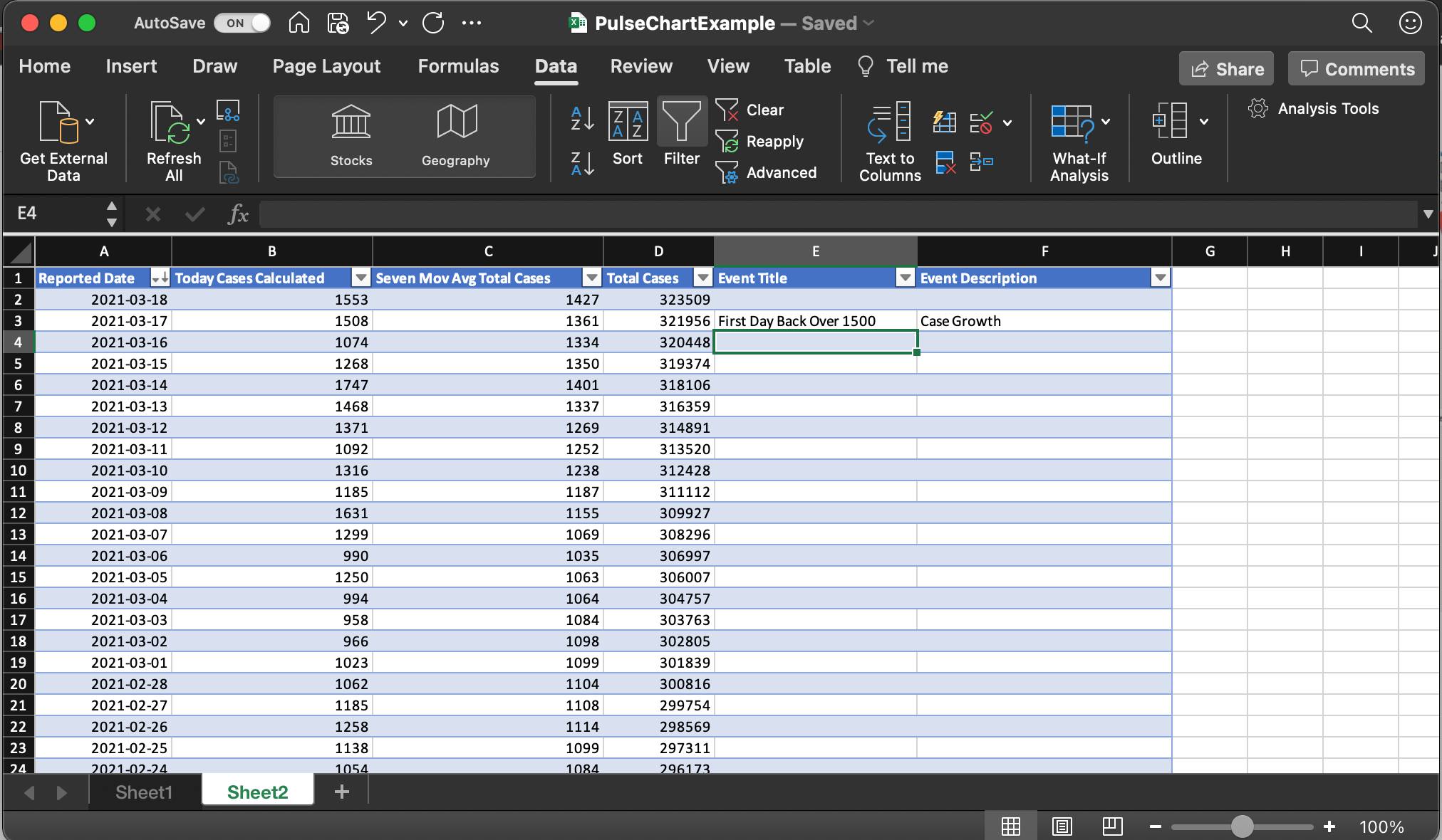
I created an Excel file from a CSV, pictured below. You need to have a Date to use as the Timestamp, a value, and Events if you want to show events.
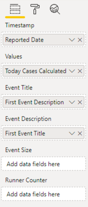
Once you have imported the data, the Pulse Chart takes the following elements shown in the below capture.
Step 3 – Populate the Fields
Populating the data fields is pretty straightforward. You will find that there are many options that you can have, making this a very flexible visualization.
The Timestamp is the dates that cover the data set you are working with
The Values are what the line is drawn to
The Event title is the event text you want to show
Event Description is a title on the event popup you wish to
The Event Size is a numerical value you can provide that will control the dot’s size shown when the event is displayed.
The Runner Counter will adjust what is displayed in the top right counter when the chart animates.
Step 4 – Settings and Formatting
Okay, so in the previous step, I mentioned that there were many display options; the amount of visual formatting and customization seems endless. Below I have put in the full set of formatting options on the right and have called out the Playback settings on the right. I found those changes quite a bit depending on the data.
Wrapping UP
I can often get lost in the number of visualizations and even fail to see new ones that come out. Go through the gallery of visuals and see what is new and what you might find interesting. Just throw data into Excel, do a quick Power Bi visualization, and see what you can add to your toolbox. Note that picking color combinations is also important..


